If you’re just like me, I’m sure you’ve already checked a couple of email design articles before you found this piece of content.
Did you find all those articles a bit general?
Well, so did I.
That’s why I decided to put together this comprehensive article that went through the email newsletter design best practices.
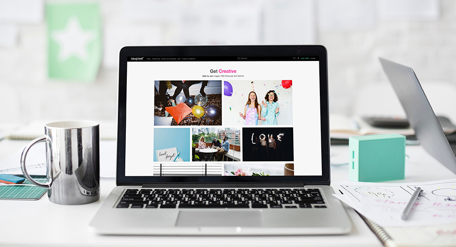
You will also find some really eye-catching and high-converting email header templates you could try for yourself. (You do not need any design skills or complicated software. Just sign up for DesignPro and create your first design for free)
If you are running out of time, just scroll through and check out the various design templates I included. They will truly inspire you in your next email design project.
[wcfgallery size=”full” columns=”1″ items=”1″ ids=”4250,4251,4252,4253,4254,4255,4256,4257,4258,4259,4260,4261,4262,4263,4264,4265″]
What comes first: email design or email content?
It’s a long-debated question, but still worth the discussion, since the web is full of those free email templates that include Lorem ipsum only.
What’s wrong with Lorem ipsum?
Nothing, as long as you have a clear idea of what will replace Lorem ipsum in your design.
Never start working on the design until you are not sure what the content will be.
Why?
… because content always comes first. If you don’t know what you want to include in your newsletter, it’s hard to come up with a design that best represent your idea.
Sit down and write the copy of your email. This is the first step. It will give you a clear idea of the look and feel you want to convey.
And if you are still not sure where to start off, our email header templates are fully packed with everything you need – from content to design, so check them out before you start brainstorming. I am sure they will give you enough food for thoughts.
Use an Email Width of 600 Pixels
600 px has been almost a standard for email width in the email industry.
You never know what email client your users might be using – which means for best visibility you have to keep your emails around or under 600 pixels wide .
(BTW, our design templates come with a preset width of 600 pixels. You don’t have to worry about the size, anymore.)
Email Layout and Mobile Friendliness
It won’t come as a surprise that the percentage of emails opened on mobile has increased 180% in the last three years alone. With that in mind, if you do not optimize your emails for mobile, you’re putting your whole campaign at risk.
When possible, stick to a single-column layout, and never use more than three columns.
A vertical layout is preferred over a horizontal one.
Make fonts and calls-to-action (CTAs) large, clear, and easy to click on (46 x 46 pixels is ideal for mobile-friendly CTAs).
Use a table of contents if you have a lot to cover.
Limit yourself to four or five sections for better visual emphasis.
Test. Test. Test
Always test your emails on a variety of email clients and devices to make sure they’re rendering correctly.
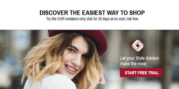
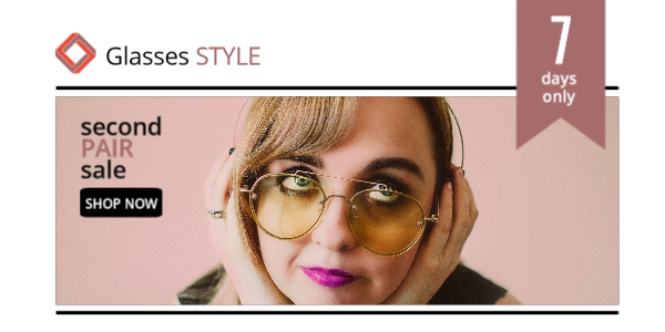
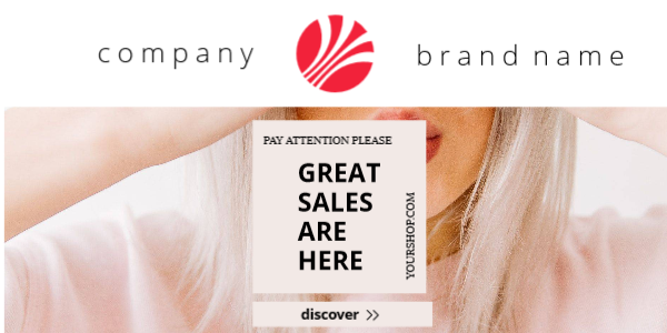
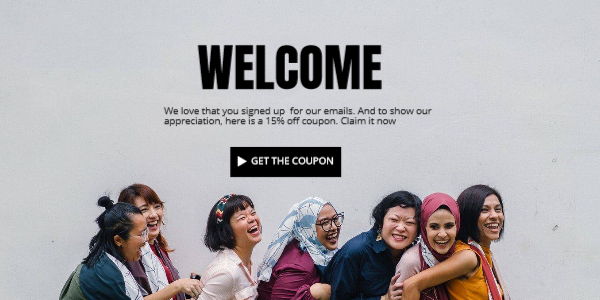
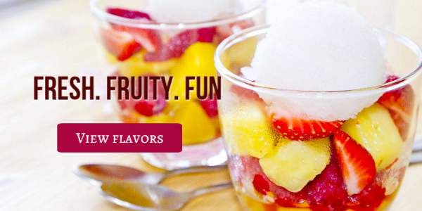
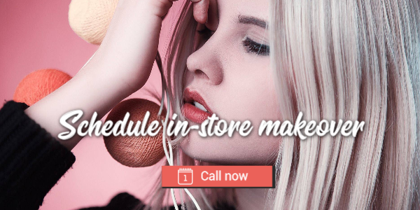
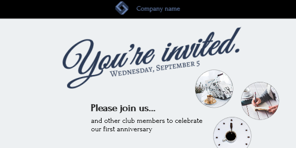
Create an Eye-Catching Header
Unless you’re sending a plain-text email, you’ll want to design a simple yet good-looking header at the top of your email.
The top-left corner is the most valuable real estate of your entire email — it’s where the reader’s eye will be drawn first. ye-tracking software has proved that people linger the longest on the left-hand side of the screen. Make good use of it by placing your company’s logo there, with other relevant information (like your phone number or an important CTA) at the right.
The header is the part of your newsletter template where you want to direct the most attention. Generally speaking, it contains the main message and a big call-to-action (CTA).
Your subscriber reads your charming subject line about a great offer with 30% off.
When he opens your email, the first thing he sees should be that offer presented in a very appealing way and and the call-to-action.
Brand Optimization
Brand optimization is by far one of the most decisive email design best practices. From including your brand name in the “from” field and using an identifiable address to ensuring that the “to” field carries the recipient’s name and not their email address, every part of your email should be on-brand.
This is indispensable for ensuring email success and sustainable brand reputation.
The bigger brand you have, the less information you have to involve in your header.
Put Key Info “Above the Fold”
“Above the fold” refers to the first things your readers see when they open the email. If you want readers to keep reading, put your most enticing content at the top of your email. The best place is within the first three inches of email depth.
Don’t think you have to wait until the end of the email to urge readers to take action. You must be very careful when you choose the image, text and the CTA button for your header.
Often, the CTAs with the best engagement are the ones at the top of an email.
At the same time, remember, the less CTAs (call to actions) you have in the entire email, the higher your CTR (click through rates) will be.
Go Visual with Graphs
“A picture’s worth a thousand words” is especially relevant to the online world. When it comes to email marketing, graphics and imagery should define content sections clearly.
Visual effects have a lasting impression on any promotional campaign. Not only do they increase your email’s visual impact, but they also help boost the credibility of your information.
Make feature headers or product offers easily clickable in the email template. It’s all about making your email alluring—there is no second chance to make a great first impression.
Use animated GIFs in the header
Since embedded video is not supported in email, most email designers turn to animated GIFs to bring that extra interaction into emails as well.
It’s become common to see GIFs instead of static images in meail, mostly because they are really effective in triggering an emotional response.
Make sure to place the GIF in the header and if you really want to emphasize your GIF, you should also get rid of the navigation menu of your email or at least make it less prominent.
Another important thing to consider is to use simple, easy to consume GIFs which are understandable at first glance and won’t confuse your subscribers with a long message.
A less complex animation usually means smaller GIF size, which is generally good because you want your email to load real quick.
Balance Text and Images
Sometimes background images may fail to load. In fact, some email clients block all images automatically. Not only that, image-heavy emails are more likely to be flagged as spam and they will never arrive at your users inbox.
To counteract these constraints, try to have a 50/50 balance of images and text. You do want images; they catch the reader’s eye and tell your story more memorable than any text could. But make sure you still tell your story in simple words.
In addition to body copy, provide alt text (and a fallback background color) for each image you use.
Remember: if you are doing promotional newsletter the rule is one email – one offer
Use Big, Basic Fonts
When choosing a font for your marketing emails, stick with standard system fonts, such as Arial, Helvetica, Georgia, Tahoma, Times New Roman, and Verdana. Other fonts may not be supported by certain email clients, so unless you set a fallback web-safe font, they may not render correctly.
Best practice font size and line height in email
Font size is important for email readability. There’s no uniform rule, but industry best practice suggests that:
- Header font size should be around 22 – 28 px.
- Body font size should be in the range of 14 – 18 px depending on the age of your audience
- Line height should be around 1.4 – 1.5 times more than the font size, for best readability.
When you design your headers and include the text in the image, then you will be able to use custom fonts that best suit your brand personality.
Call to action (CTA) best practices in emails
Just because you have a beautiful call to action button in your email, it doesn’t mean that everybody will click on it.
The design is just the one side of the equation. Call to action copy is of equal importance.
What makes a good email call to action?
Actionable language – forget about “Click here” or “Read more”. Instead try to create a sense of urgency and clearly presents what happens after someone clicks the button.
- Get your free product sample now
- Start free for 14 days
- Shop watches now
- Get your promo code
- Sign up for early access
Make the CTA stand out – Your call to action must stand out, so always make sure that it has:
- Easily noticeable color
- Enoughl white-space around
- Font type and spacing, which make it readable at first glance
When it comes to emails and newsletters, the subject line and header are where you can start to have some fun. No matter what you decide to do, be sure to stay on brand and use your logo, as it helps your subscribers know they’re looking at an email from your brand.