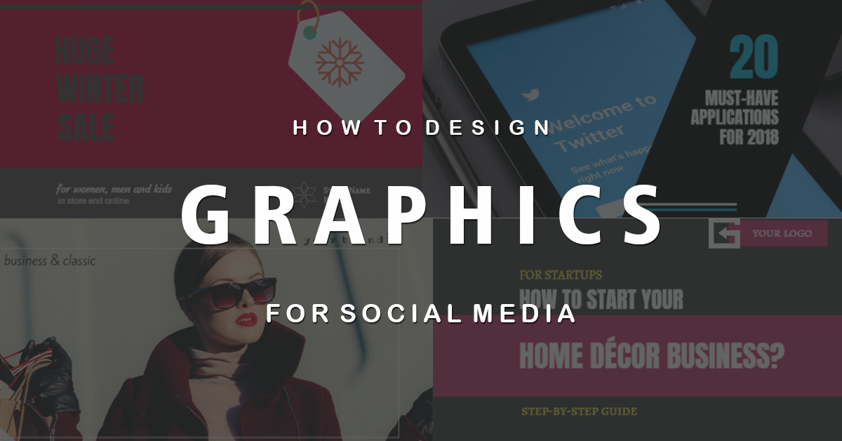
This is a step-by-step guide to creating eye-catching images for social media that drive engagement and leads – all without a designer.
You are aware of the power of visual content. Yes, social media posts with images are proven to convert better than posts with no images.
In a survey, 37% of marketers said visual marketing was the most important form of content for their business, second only to blogging (38%).
If you embrace visual content in 2018, you will reap the rewards of higher returns – in terms of more fans, followers, readers, leads, clients and, of course, revenue.
But there’s so much more than an image when creating graphics for your marketing promotions. You should consider things like copy, color, placement, size, call to action, etc.
To stand out in your industry and to catch the attention of fans, consider creating attention grabbing, original visual content on a consistent basis.
If you’re not a designer and you don’t know where to start, then you are in the right place, as this guide will help you!
DesignPro is the simplest and intuitive graphic tool. Have fun designing and testing. Sign Up Free
1. Start with an Idea
This might sound like no-brainer but it’s important you spend enough time planning what you are going to share with your fans and followers.
Start thinking about the “type” of image you want to create. It should do one of the following things:
- Entertain in some way
- Empower or motivate
- Educate and give insights
- Solve a problem
- Promote a product, service, seminar, contest, event, etc
Types of original content that share well on social media are:
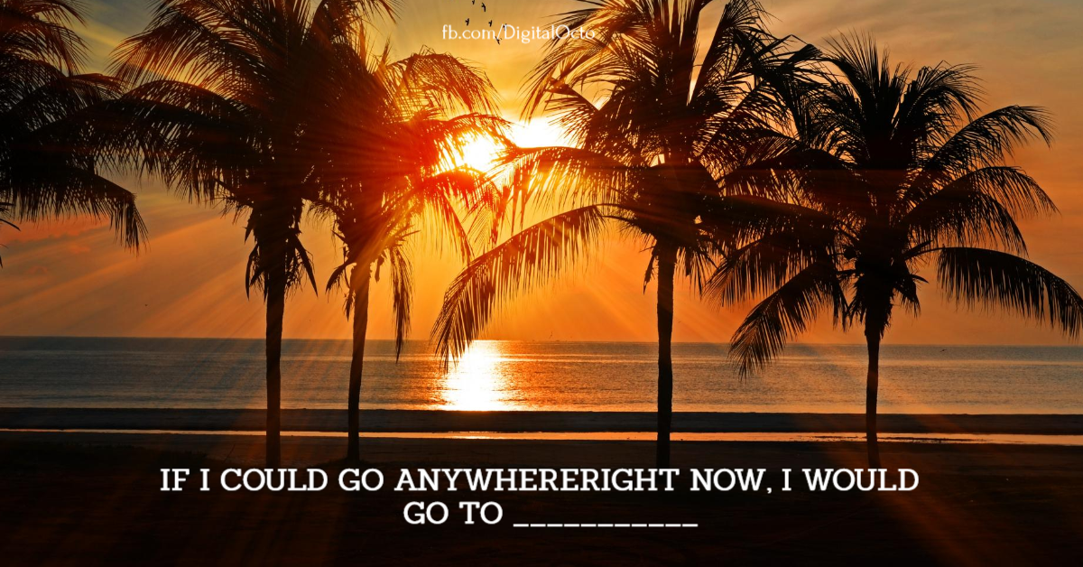
- Quotes
- Tips
- How-To/Tutorials
- Checklists
- Funny Photos/Images/Videos
- Visuals that evoke emotion
PRO TIP: If you want to save time, you’d better plan your posts for a week ahead and then schedule them with SmartPublisher. You can still create images on the day you post them, but getting some images ready to schedule ahead of time, can make your life easier.
SmartPublisher is a post planning tool to schedule and post content to social media. Sign Up Free
2. Choose the right size
Honestly, you do not have to be familiar with all image sizes and variations for the different social networks. There are two key things you need to know that will help you create visuals without being overwhelmed by options:
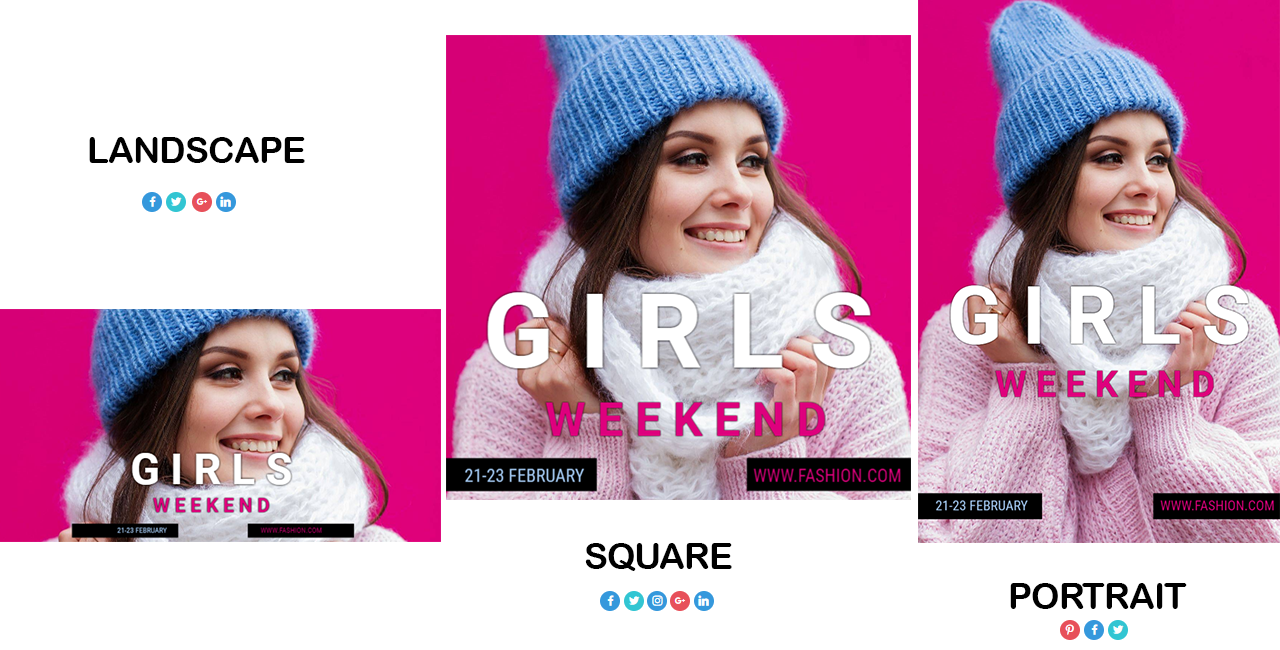
- There are 3 image sizes that cover most platforms:
- Landscape – works well on Twitter, Facebook, LinkedIn and Google+.
- Square – works well for Instagram, Twitter, and Facebook.
- Portrait – works well on Pinterest (and can be shared reasonably well to Facebook or Google+).
- Choose 2-3 platforms you want to start with. Once you know where you will share your graphic to, it becomes much more easier to choose your primary image sizes.
For instance, if you are focusing mainly on Instagram, Facebook and Twitter, you would start with square images.
If you are focusing mainly on Twitter and LinkedIn, you would like to create landscape images first.
REMEMBER: You can always use the resize option in DesignPro to easily change the size of your image.
3. Use a pre-made design template
So you have a general idea on the type of content you will create, you’ve decided on the size of image, now it’s time to start putting it all together.
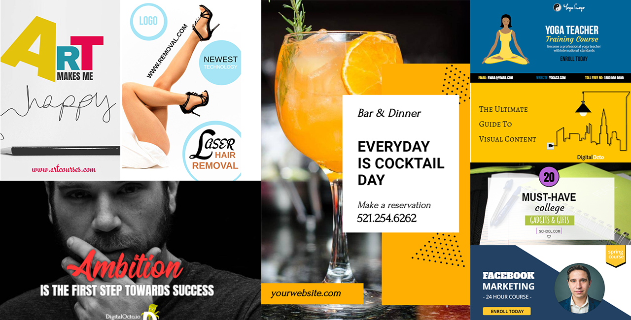
And of course the quickest and simplest way to start off is with a template. Whether you are a non-designer who needs some help, or you are a design pro who wants to create images fast, templates are an excellent choice.
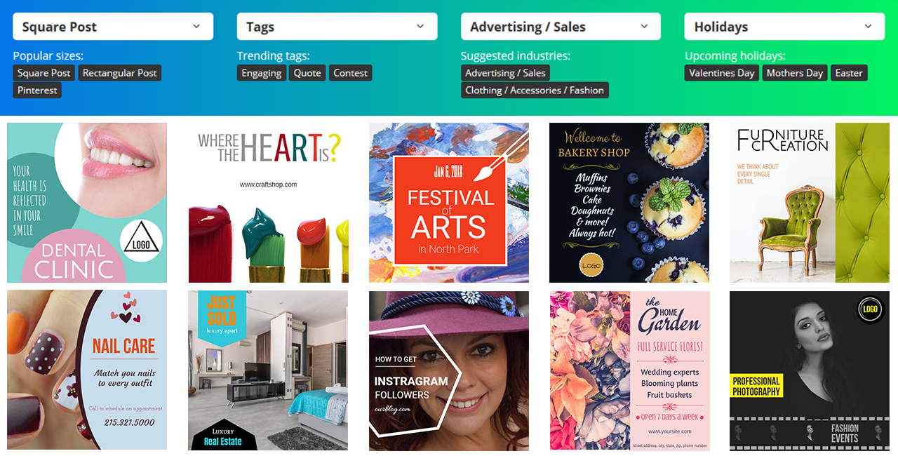
You can choose from more than 1500 templates that are free to use and easy to edit (here is a short guide to how to select the right template). And if you still need help, you can write to [email protected] and we will do our best to help you out.
Once you selected the template you can change pretty much everything – text, background image, colors, graphic elements, or use it exactly as it is.
TIP: Always try to add your company logo to your images. This is the easiest way for your current customers to recognize your posts while scrolling down their News feed. It also helps create brand awareness.
4. Choose a background image for your social media graphics
When it comes to choosing an image for your design, you can use your own photograph, a stock photograph or an icon (graphic element). Wherever possible use your own photos as they tell your brand story like nobody else can.
Avoid the mistake that most brands make and stay away from banality or cheesy stock photography. Some people look only at the image, so make sure that your image help to tell the story and don’t distract your audience from your main message.
When selecting an image, you need to:
- Avoid busy background images that make your text hard to read.
- Make sure your image support the text in your graphic instead of including generic images
- Make sure the main elements of your image are in focus
- Find images with clear space for you to place your text
- Images that evoke emotions really work well and are more likely to be shared.
- Brighter images with crisp colors work better
5. Order your title, subtitle and body copy by size

When it comes to the text you will put on your image, there is a simple rule you need to follow: from largest to smallest in a naturally progressive order.
This means that your title as the first thing that people will notice should stand out. This can be done by making it dominant in size, and using a strong eye-catching font. The subtitle should support your title at a relatively smaller type size.
Body copy (if you have any) should be the smallest in size but make sure it’s clear and easy to read.
You can go with only a title and put the focus on the most important word in it. This is another way to catch user’s attention and then naturally let them read the whole copy.
TIP: Write all the text you’ve planned first and then play around with fonts, sizes, and colors. Some fonts really go well together. It takes some time to find the right formula though. That’s why using templates makes it easier for you.
6. Increase the size of elements to reflect their importance

Remember to keep the most important objects the largest. When the size of elements is increased it will reflect visual importance.
For instance, if you want to create some sense of urgency, you can use a clock icon that forces users to act quick.
Here is how choosing the right icons and increasing their size can behave as a ‘call to action’. The more relevant the icon, the better it will function.
7. Use color as a visual highlight

Use the power of colors to your advantage. Colors have the ability to evoke feelings and also act as an eye magnet. With its help you can make a distinction between what is important and what is not.
Applying a bright, bold color to a particular text will highlight its significance and naturally draw the eye to it, making it a focal component within your graphic.
In the example above, a color picker tool has been used to match the text color of the word “Flourish” with the color of the flower in the background image. Notice how this makes it a dominant feature of the design.
8. Designing Call-to-Action Graphics

It’s useful to think about what your intention is for each piece of visual content you create. You should be careful when you choose your call to action. You need to know what the purpose of your graphic is – get more traffic, leads, sign ups, etc. Once you decided, follow the tips below:
Make it actionable.
Some call to actions are more action-oriented than others. For example “Get Started Now” is telling the reader to take action immediately, compared to “Learn more” – which gives less sense of urgency and respectively is much less action-oriented.
Create urgency.
In the example above, “Offer Expires in 2 hours,” and “Flash Sale” are conveying the importance of urgency to the users and give them a reason to take action immediately as to not “miss it out.”
Include numbers
Numbers act as social proof. Other people love this product/service, it gives them something of value, which means it’s worth it. Taking an action is justified and includes you in a community of other people who are taking that same action. Works well for subscriptions, webinars, events or downloading an ebook.
Sometimes visual content is posted to social media to help build engagement. The goal is get people react to the post and not click on a link. In this case, your call to action can take the form of:
- Like
- Comment
- Share
TIP: There are two places you can add a call to action:
- On the image – something like “Read More” or “Click Here” or it can be more subtle like “New On the Blog”
- In the description – You have plenty of room in the description to add more content and the desired call to action. Remember to add a link too if you have one.
Or on both! Often including call to action to the image and description triples the chance an action to be taken. So go crazy and test what works best for your audience.
9. Repurpose high performing graphics across multiple platforms

When it comes to graphics, proving what works comes down to testing, redesigning, tweaking, and trying new things constantly.
It’s important to note that what works for some businesses or industries may not work for others. Research your competitors, try to figure what works for them and then see if you will receive the same level of engagement and response from your users. Tweak if necessary.
It’s not only the image, you need to put on test. The copy testing caries the same weight. So you need to figure out what the winning combination is and then roll it out across multiple social media platforms.
For example if a certain colored graphic is converting highest on Facebook, repurpose it for Twitter, LinkedIn and more.
10. Publish it
Don’t forget to post and promote your image.
As we discussed earlier, you can create a single image to post to multiple social networks. Also you can schedule it to go live later on or multiple times in the future.
You may not be a firm believer in reposting the same content on social media, but we found this work surprisingly well and we strongly advocate that you should try this approach to promote your visuals and reach larger audience.
TIP: SmartPublisher is a great tool to manage multiple social profiles at once. It works with DesignPro so you will be able to create your graphics and then without leaving the tool to schedule it to your social media profiles.
Conclusion
All you need to remember is to be consistent with your visual content. Post regularly and always come back to engage. If you do that on any platform you will see your following and engagement growing.
Use graphics wisely to your advantage: place them wherever you can. They enhance the reach adn impact of your content and products, so get out there and have fun designing and testing!
Ger started now with free DesignPro account.
DesignPro is the simplest and intuitive graphic tool. Have fun designing and testing. Sign Up Free